トレバー・バウアー(Trevor Bauer) の研究①

SHOGAKU
2 years ago
ローカルライン京急線にバウアー(Trevor Bauer)が現れた、ということでとても興味が出てきたのでバウアーについて勉強した。
==Part1==
とりあえず、データを見る
https://baseballsavant.mlb.com/savant-player/trevor-bauer-545333
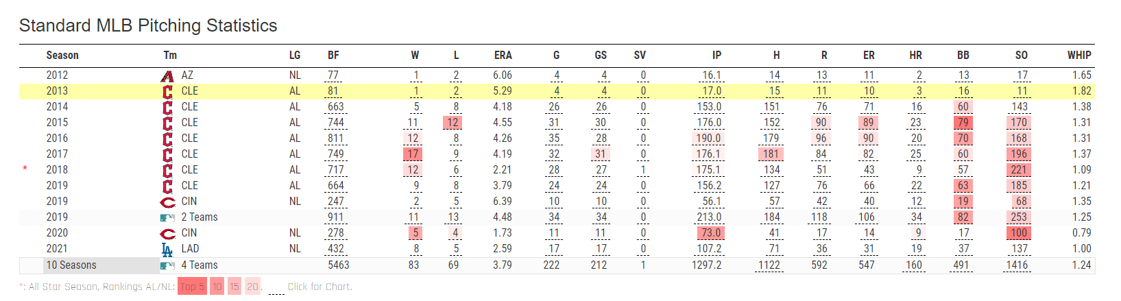
データ取得
2019~2021のデータを見る
!pip install pybaseball
from pybaseball import statcast
import pandas as pd

import pandas as pd
from pybaseball import statcast

dates = [
    '2021-04-02', '2021-04-07', '2021-04-13', '2021-04-18', '2021-04-24', '2021-04-29',
    '2021-05-04', '2021-05-09', '2021-05-15', '2021-05-21', '2021-05-26', '2021-05-31',
    '2021-06-06', '2021-06-12', '2021-06-18', '2021-06-23', '2021-06-28', '2020-07-26',
    '2020-08-02', '2020-08-07', '2020-08-19', '2020-08-24', '2020-08-29', '2020-09-04',
    '2020-09-09', '2020-09-14', '2020-09-19', '2020-09-23', '2019-03-30', '2019-04-04',
    '2019-04-10', '2019-04-15', '2019-04-20', '2019-04-25', '2019-04-30', '2019-05-06',
    '2019-05-11', '2019-05-16', '2019-05-21', '2019-05-26', '2019-05-31', '2019-06-06',
    '2019-06-11', '2019-06-16', '2019-06-21', '2019-06-26', '2019-07-02', '2019-07-07',
    '2019-07-13', '2019-07-18', '2019-07-23', '2019-07-28', '2019-08-03', '2019-08-09',
    '2019-08-14', '2019-08-19', '2019-08-25', '2019-08-31', '2019-09-04', '2019-09-10',
    '2019-09-15', '2019-09-22'
]

# Create an empty DataFrame to store the data
df_545333_all_dates = pd.DataFrame()

# Fetch data for each date and concatenate
for date in dates:
    df_single_day = statcast(start_dt=date, end_dt=date)
    df_545333_single_day = df_single_day[df_single_day['pitcher'] == 545333]
    df_545333_all_dates = pd.concat([df_545333_all_dates, df_545333_single_day])

# Reset the index of the final DataFrame
df_545333_all_dates.reset_index(drop=True, inplace=True)
球種確認
# 投球結果を抽出
df_545333 = df_545333_all_dates

# df_545333のpitch_typeカラムに含まれるユニークな球種を確認する
unique_pitch_types = df_545333['pitch_type'].unique()

# 確認した球種を表示する
print(unique_pitch_types)
結果
['FC' 'FF' 'ST' 'KC' 'CH' 'SI' nan]
- FC: カットファストボール
- FF: フォーシームファストボール
- ST: スライダー or Sweeper
- KC: ナックルカーブ
- CH: チェンジアップ
- SI: 2シームファストボール
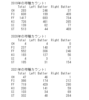
各年の球種
import pandas as pd

def pitch_counts(df):
    # 左打者と右打者に対する投球データを抽出
    df_L = df[df['stand'] == 'L']
    df_R = df[df['stand'] == 'R']

    # 各カテゴリーでの球種の出現回数をカウント
    total_counts = df['pitch_type'].value_counts()
    left_counts = df_L['pitch_type'].value_counts()
    right_counts = df_R['pitch_type'].value_counts()

    # 出現回数をデータフレームにまとめる
    pitch_counts_table = pd.DataFrame({'Total': total_counts, 'Left Batter': left_counts, 'Right Batter': right_counts})

    # NaNを0に置き換える
    pitch_counts_table.fillna(0, inplace=True)

    # カウントを整数に変換する
    pitch_counts_table = pitch_counts_table.astype(int)

    return pitch_counts_table

# 続けて、球種カウントのコードを実行します。

# Split the data by year
df_2019 = df_545333_all_dates[df_545333_all_dates['game_year'] == 2019]
df_2020 = df_545333_all_dates[df_545333_all_dates['game_year'] == 2020]
df_2021 = df_545333_all_dates[df_545333_all_dates['game_year'] == 2021]

# Get pitch counts for each year
pitch_counts_2019 = pitch_counts(df_2019)
pitch_counts_2020 = pitch_counts(df_2020)
pitch_counts_2021 = pitch_counts(df_2021)

# Display the results
print("2019年の球種カウント:")
print(pitch_counts_2019)
print("\n2020年の球種カウント:")
print(pitch_counts_2020)
print("\n2021年の球種カウント:")
print(pitch_counts_2021)
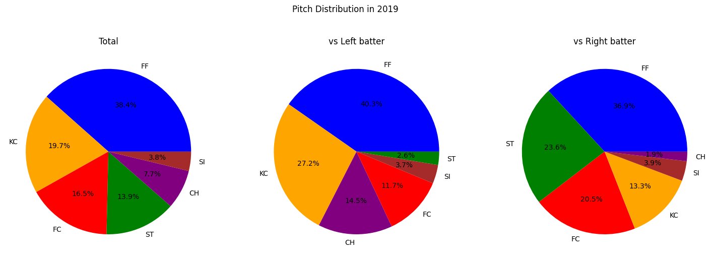
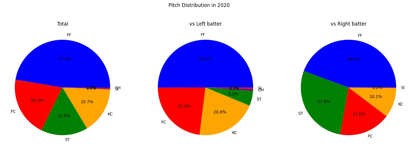
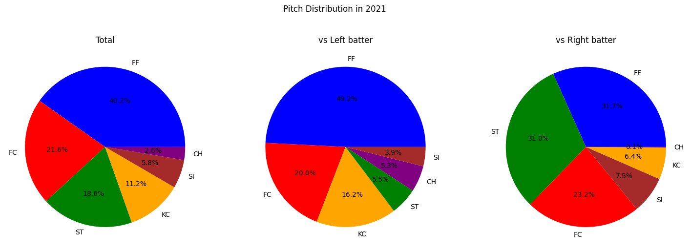
各年の球種(円グラフ)
フォーシームファストボールが多いピッチャーであることがわかる
import matplotlib.pyplot as plt

def plot_pitch_distribution(df, year):
    df_L = df[df['stand'] == 'L']
    df_R = df[df['stand'] == 'R']

    fig, axs = plt.subplots(1, 3, figsize=(18, 6))
    plt.suptitle(f'Pitch Distribution in {year}')

    colors = {'FC': 'red', 'FF': 'blue', 'ST': 'green', 'KC': 'orange', 'CH': 'purple', 'SI': 'brown'}

    # Total
    df['pitch_type'].value_counts().plot(kind='pie', ax=axs[0], autopct='%.1f%%', colors=[colors[key] for key in df['pitch_type'].value_counts().index])
    axs[0].set_title('Total')
    axs[0].set_ylabel('')

    # vs Left batter
    df_L['pitch_type'].value_counts().plot(kind='pie', ax=axs[1], autopct='%.1f%%', colors=[colors[key] for key in df_L['pitch_type'].value_counts().index])
    axs[1].set_title('vs Left batter')
    axs[1].set_ylabel('')

    # vs Right batter
    df_R['pitch_type'].value_counts().plot(kind='pie', ax=axs[2], autopct='%.1f%%', colors=[colors[key] for key in df_R['pitch_type'].value_counts().index])
    axs[2].set_title('vs Right batter')
    axs[2].set_ylabel('')

    plt.show()

# Plot pitch distribution for 2019, 2020, and 2021 data
plot_pitch_distribution(df_2019, 2019)
plot_pitch_distribution(df_2020, 2020)
plot_pitch_distribution(df_2021, 2021)
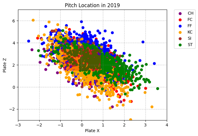
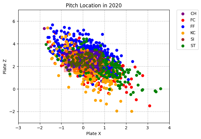
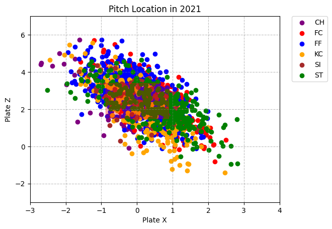
各年の投球コース (散布図)
真ん中の薄い赤色は、ざっくりストライクゾーンです
import matplotlib.pyplot as plt

def plot_pitch_location(df, year):
    # データを pitch_type ごとにグループ分けする
    grouped = df.groupby('pitch_type')

    colors = {'FC': 'red', 'FF': 'blue', 'ST': 'green', 'KC': 'orange', 'CH': 'purple', 'SI': 'brown'}

    # pitch_type ごとに、'plate_x' を X 軸、'plate_z' を Y 軸とした散布図を作成する
    for pitch_type, data in grouped:
        plt.scatter(data['plate_x'], data['plate_z'], label=pitch_type, color=colors[pitch_type])

    # ストライクゾーン
    x = [-0.88, 0.88, 0.88, -0.88, -0.88]
    y = [1.51, 1.51, 3.4, 3.4, 1.51]
    plt.fill(x, y, color='r', alpha=0.3)

    # 凡例を表示する
    plt.legend(bbox_to_anchor=(1.05, 1), loc='upper left', borderaxespad=0)

    plt.xlim(-3, 4)
    plt.ylim(-3, 7)

    plt.xlabel('Plate X')
    plt.ylabel('Plate Z')

    # 罫線
    plt.grid(which='both', linestyle='--', color='gray', alpha=0.5)

    plt.title(f'Pitch Location in {year}')

    # グラフを表示する
    plt.show()

# 2019年、2020年、2021年のデータに対して投球位置をプロット
plot_pitch_location(df_2019, 2019)
plot_pitch_location(df_2020, 2020)
plot_pitch_location(df_2021, 2021)
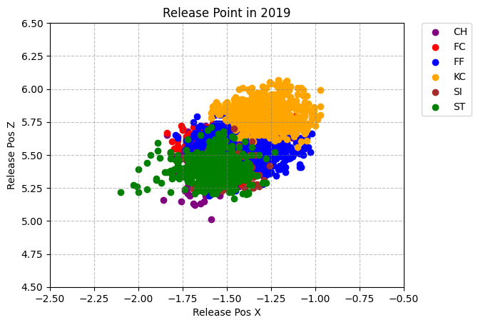
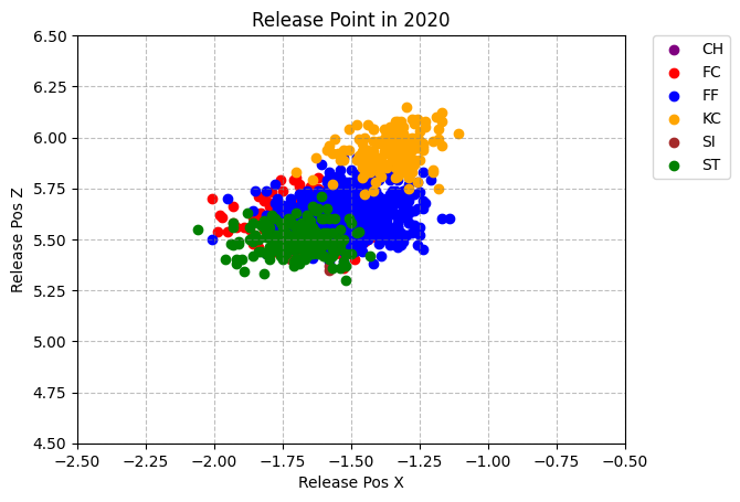
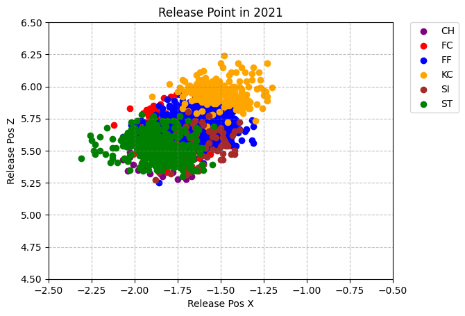
各年のリリースポイント (散布図)
キャッチャーから見たリリース位置です
import matplotlib.pyplot as plt

def plot_release_point(df, year):
    # データを pitch_type ごとにグループ分けする
    grouped = df.groupby('pitch_type')

    colors = {'FC': 'red', 'FF': 'blue', 'ST': 'green', 'KC': 'orange', 'CH': 'purple', 'SI': 'brown'}

    # pitch_type ごとに、'release_pos_x' を X 軸、'release_pos_z' を Y 軸とした散布図を作成する
    for pitch_type, data in grouped:
        plt.scatter(data['release_pos_x'], data['release_pos_z'], label=pitch_type, color=colors[pitch_type])

    # 凡例を表示する
    plt.legend(bbox_to_anchor=(1.05, 1), loc='upper left', borderaxespad=0)

    plt.xlabel('Release Pos X')
    plt.ylabel('Release Pos Z')

    # 罫線
    plt.grid(which='both', linestyle='--', color='gray', alpha=0.5)

    plt.title(f'Release Point in {year}')

    # X軸とY軸のレン.5ジを指定
    plt.xlim(-2.5, -0.5)
    plt.ylim(4.5, 6.5)

    # グラフを表示する
    plt.show()

# 2019年、2020年、2021年のデータに対してリリースポイントをプロット
plot_release_point(df_2019, 2019)
plot_release_point(df_2020, 2020)
plot_release_point(df_2021, 2021)
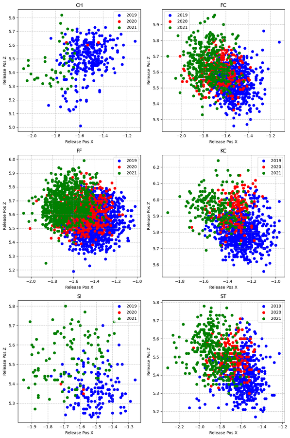
各年の各球種ごとにリリースポイント (散布図)
毎年少しづつ左に変わっていそう、フォームの微調整か
import matplotlib.pyplot as plt

def plot_release_point_by_year(df_2019, df_2020, df_2021):
    # 3つのデータフレームを結合
    combined_df = pd.concat([df_2019, df_2020, df_2021])

    # データを pitch_type ごとにグループ分けする
    grouped = combined_df.groupby('pitch_type')

    # グラフの数と行列を指定
    nrows = 3
    ncols = 2

    # サブプロットのタイトル用に球種を格納
    titles = []

    fig, axes = plt.subplots(nrows=nrows, ncols=ncols, figsize=(10, 15))

    for idx, (pitch_type, data) in enumerate(grouped):
        # サブプロットのタイトルに球種を追加
        titles.append(pitch_type)

        # サブプロットに対応する行と列のインデックスを計算
        row = idx // ncols
        col = idx % ncols

        ax = axes[row][col]

        # 2019年、2020年、2021年のデータをそれぞれプロット
        data_2019 = data[data.index.isin(df_2019.index)]
        data_2020 = data[data.index.isin(df_2020.index)]
        data_2021 = data[data.index.isin(df_2021.index)]

        ax.scatter(data_2019['release_pos_x'], data_2019['release_pos_z'], label='2019', color='blue')
        ax.scatter(data_2020['release_pos_x'], data_2020['release_pos_z'], label='2020', color='red')
        ax.scatter(data_2021['release_pos_x'], data_2021['release_pos_z'], label='2021', color='green')

        ax.set_title(pitch_type)
        ax.set_xlabel('Release Pos X')
        ax.set_ylabel('Release Pos Z')

        # 罫線
        ax.grid(which='both', linestyle='--', color='gray', alpha=0.5)

        # 凡例を表示する
        ax.legend()

    # グラフを表示する
    plt.tight_layout()
    plt.show()

# 各球種ごとにグラフを分けて、2019年、2020年、2021年のデータを色分けしてプロット
plot_release_point_by_year(df_2019, df_2020, df_2021)
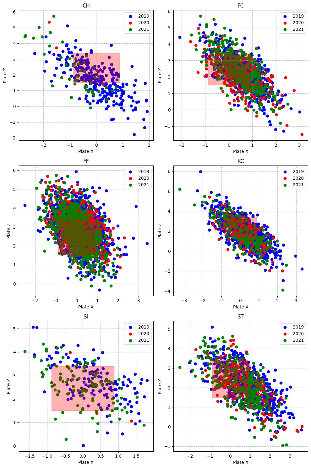
各年の各球種ごとに投球コース (散布図)
FC: カットファストボールは、ほぼ投げないコースがあるようだ
import matplotlib.pyplot as plt

def plot_pitch_location_by_year(df_2019, df_2020, df_2021):
    # 3つのデータフレームを結合
    combined_df = pd.concat([df_2019, df_2020, df_2021])

    # データを pitch_type ごとにグループ分けする
    grouped = combined_df.groupby('pitch_type')

    # グラフの数と行列を指定
    nrows = 3
    ncols = 2

    # サブプロットのタイトル用に球種を格納
    titles = []

    fig, axes = plt.subplots(nrows=nrows, ncols=ncols, figsize=(10, 15))

    for idx, (pitch_type, data) in enumerate(grouped):
        # サブプロットのタイトルに球種を追加
        titles.append(pitch_type)

        # サブプロットに対応する行と列のインデックスを計算
        row = idx // ncols
        col = idx % ncols

        ax = axes[row][col]

        # 2019年、2020年、2021年のデータをそれぞれプロット
        data_2019 = data[data.index.isin(df_2019.index)]
        data_2020 = data[data.index.isin(df_2020.index)]
        data_2021 = data[data.index.isin(df_2021.index)]

        ax.scatter(data_2019['plate_x'], data_2019['plate_z'], label='2019', color='blue')
        ax.scatter(data_2020['plate_x'], data_2020['plate_z'], label='2020', color='red')
        ax.scatter(data_2021['plate_x'], data_2021['plate_z'], label='2021', color='green')

        # ストライクゾーン
        x = [-0.88, 0.88, 0.88, -0.88, -0.88]
        y = [1.51, 1.51, 3.4, 3.4, 1.51]
        ax.fill(x, y, color='r', alpha=0.3)

        ax.set_title(pitch_type)
        ax.set_xlabel('Plate X')
        ax.set_ylabel('Plate Z')

        # 罫線
        ax.grid(which='both', linestyle='--', color='gray', alpha=0.5)

        # 凡例を表示する
        ax.legend()

    # グラフを表示する
    plt.tight_layout()
    plt.show()

# 各球種ごとにグラフを分けて、2019年、2020年、2021年のデータを色分けしてプロット
plot_pitch_location_by_year(df_2019, df_2020, df_2021)
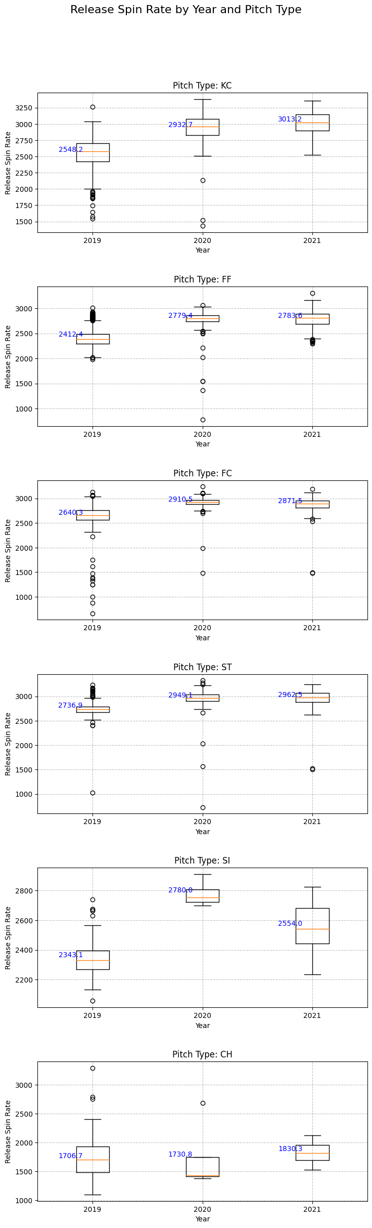
各年の各球種ごとにリリーススピンレート (Boxplot)
2020からスピンレートが上がった球種がある
三振との関係などは次回
import matplotlib.pyplot as plt
import pandas as pd

def plot_spin_rate_by_year_boxplot(df_2019, df_2020, df_2021, pitch_types):
    pitch_types = [pt for pt in pitch_types if pt is not None and pd.notna(pt)]  # nan を除外
    fig, axs = plt.subplots(len(pitch_types), 1, figsize=(8, len(pitch_types) * 4))

    for i, pitch_type in enumerate(pitch_types):
        ax = axs[i]

        grouped_2019 = df_2019[df_2019['pitch_type'] == pitch_type].dropna(subset=['release_spin_rate'])
        grouped_2020 = df_2020[df_2020['pitch_type'] == pitch_type].dropna(subset=['release_spin_rate'])
        grouped_2021 = df_2021[df_2021['pitch_type'] == pitch_type].dropna(subset=['release_spin_rate'])

        data_to_plot = []
        labels = []
        if not grouped_2019.empty:
            data_to_plot.append(grouped_2019['release_spin_rate'])
            labels.append('2019')
        if not grouped_2020.empty:
            data_to_plot.append(grouped_2020['release_spin_rate'])
            labels.append('2020')
        if not grouped_2021.empty:
            data_to_plot.append(grouped_2021['release_spin_rate'])
            labels.append('2021')

        if data_to_plot:
            bp = ax.boxplot(data_to_plot, labels=labels)
            for j, d in enumerate(data_to_plot):
                mean_val = d.mean()
                ax.text(j + 0.8, mean_val, f"{mean_val:.1f}", ha='center', va='bottom', fontsize=10, color='blue')

        ax.set_title(f"Pitch Type: {pitch_type}")
        ax.set_xlabel('Year')
        ax.set_ylabel('Release Spin Rate')

        # 罫線
        ax.grid(which='both', linestyle='--', color='gray', alpha=0.5)

    fig.suptitle('Release Spin Rate by Year and Pitch Type', fontsize=16, y=1.02)
    plt.tight_layout(pad=3)
    plt.show()

# 2019年、2020年、2021年のデータに対してリリーススピンレートをプロット
pitch_types_2019 = df_2019['pitch_type'].unique()
pitch_types_2020 = df_2020['pitch_type'].unique()
pitch_types_2021 = df_2021['pitch_type'].unique()

# すべての年に存在する球種を取得
all_pitch_types = set(pitch_types_2019) | set(pitch_types_2020) | set(pitch_types_2021)

plot_spin_rate_by_year_boxplot(df_2019, df_2020, df_2021, all_pitch_types)
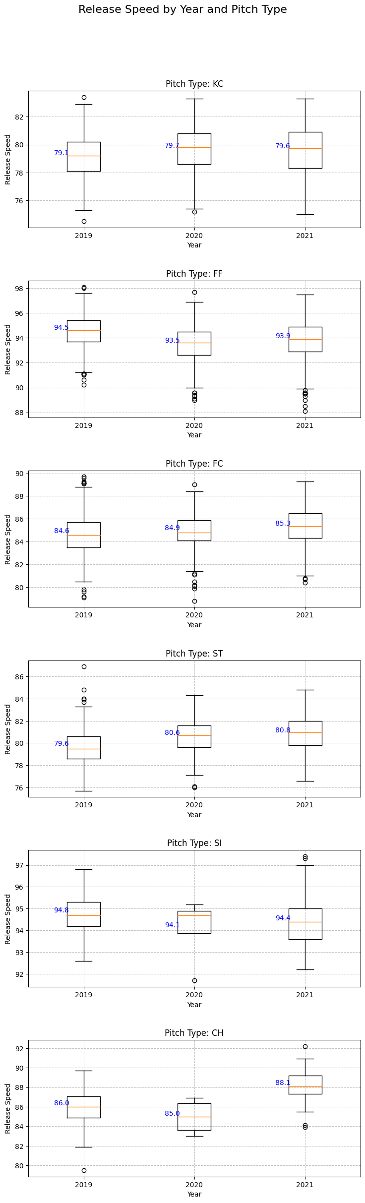
各年の各球種ごとにスピード (Boxplot)
スピードはおおきな変化なさそう
import matplotlib.pyplot as plt
import pandas as pd

def plot_release_speed_by_year_boxplot(df_2019, df_2020, df_2021, pitch_types):
    pitch_types = [pt for pt in pitch_types if pt is not None and pd.notna(pt)]  # nan を除外
    fig, axs = plt.subplots(len(pitch_types), 1, figsize=(8, len(pitch_types) * 4))

    for i, pitch_type in enumerate(pitch_types):
        ax = axs[i]

        grouped_2019 = df_2019[df_2019['pitch_type'] == pitch_type].dropna(subset=['release_speed'])
        grouped_2020 = df_2020[df_2020['pitch_type'] == pitch_type].dropna(subset=['release_speed'])
        grouped_2021 = df_2021[df_2021['pitch_type'] == pitch_type].dropna(subset=['release_speed'])

        data_to_plot = []
        labels = []
        if not grouped_2019.empty:
            data_to_plot.append(grouped_2019['release_speed'])
            labels.append('2019')
        if not grouped_2020.empty:
            data_to_plot.append(grouped_2020['release_speed'])
            labels.append('2020')
        if not grouped_2021.empty:
            data_to_plot.append(grouped_2021['release_speed'])
            labels.append('2021')

        if data_to_plot:
            bp = ax.boxplot(data_to_plot, labels=labels)
            for j, d in enumerate(data_to_plot):
                mean_val = d.mean()
                ax.text(j + 0.8, mean_val, f"{mean_val:.1f}", ha='center', va='bottom', fontsize=10, color='blue')

        ax.set_title(f"Pitch Type: {pitch_type}")
        ax.set_xlabel('Year')
        ax.set_ylabel('Release Speed')

        # 罫線
        ax.grid(which='both', linestyle='--', color='gray', alpha=0.5)

    fig.suptitle('Release Speed by Year and Pitch Type', fontsize=16, y=1.02)
    plt.tight_layout(pad=3)
    plt.show()

# 2019年、2020年、2021年のデータに対してリリーススピードをプロット
pitch_types_2019 = df_2019['pitch_type'].unique()
pitch_types_2020 = df_2020['pitch_type'].unique()
pitch_types_2021 = df_2021['pitch_type'].unique()

# すべての年に存在する球種を取得
all_pitch_types = set(pitch_types_2019) | set(pitch_types_2020) | set(pitch_types_2021)

plot_release_speed_by_year_boxplot(df_2019, df_2020, df_2021, all_pitch_types)
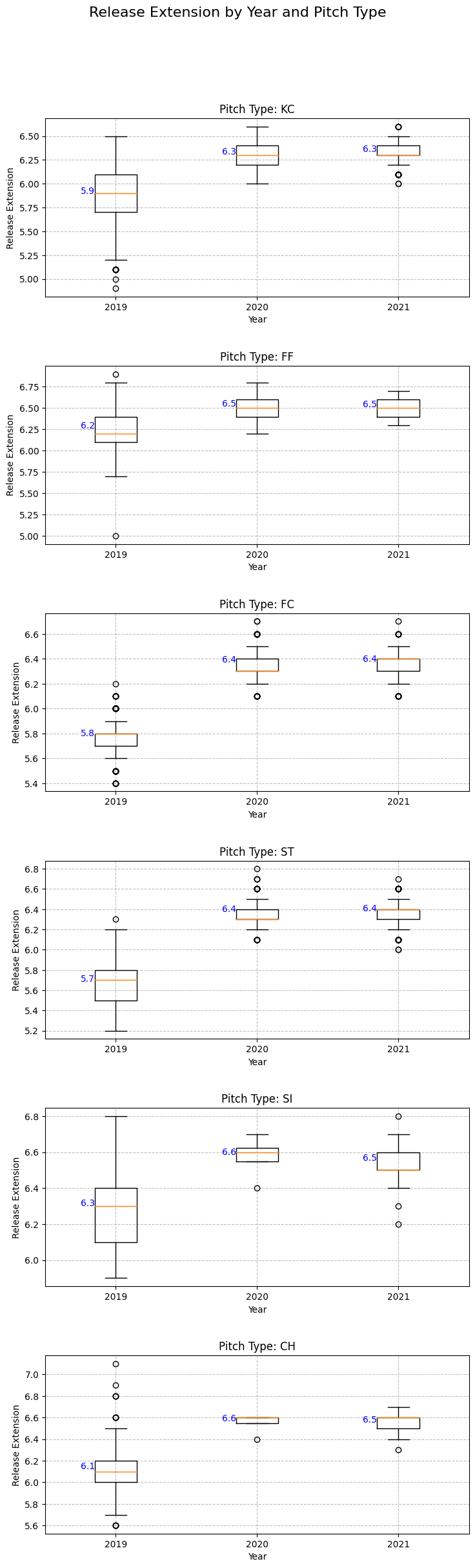
release_extension: 投手のリリースポイントからホームプレートまでの距離(ft)
各年の各球種ごとにリリースからホームまで (Boxplot)
スピンレートとも多少は相関あるかもしれない。
距離が長くなるのは、投手側に不利になりそうだが。数字を読み違えてるかなあ
import matplotlib.pyplot as plt
import pandas as pd

def plot_release_extension_by_year_boxplot(df_2019, df_2020, df_2021, pitch_types):
    pitch_types = [pt for pt in pitch_types if pt is not None and pd.notna(pt)]  # nan を除外
    fig, axs = plt.subplots(len(pitch_types), 1, figsize=(8, len(pitch_types) * 4))

    for i, pitch_type in enumerate(pitch_types):
        ax = axs[i]

        grouped_2019 = df_2019[df_2019['pitch_type'] == pitch_type].dropna(subset=['release_extension'])
        grouped_2020 = df_2020[df_2020['pitch_type'] == pitch_type].dropna(subset=['release_extension'])
        grouped_2021 = df_2021[df_2021['pitch_type'] == pitch_type].dropna(subset=['release_extension'])

        data_to_plot = []
        labels = []
        if not grouped_2019.empty:
            data_to_plot.append(grouped_2019['release_extension'])
            labels.append('2019')
        if not grouped_2020.empty:
            data_to_plot.append(grouped_2020['release_extension'])
            labels.append('2020')
        if not grouped_2021.empty:
            data_to_plot.append(grouped_2021['release_extension'])
            labels.append('2021')

        if data_to_plot:
            bp = ax.boxplot(data_to_plot, labels=labels)
            for j, d in enumerate(data_to_plot):
                mean_val = d.mean()
                ax.text(j + 0.8, mean_val, f"{mean_val:.1f}", ha='center', va='bottom', fontsize=10, color='blue')

        ax.set_title(f"Pitch Type: {pitch_type}")
        ax.set_xlabel('Year')
        ax.set_ylabel('Release Extension')

        ax.grid(which='both', linestyle='--', color='gray', alpha=0.5)

    fig.suptitle('Release Extension by Year and Pitch Type', fontsize=16, y=1.02)
    plt.tight_layout(pad=3)
    plt.show()

pitch_types_2019 = df_2019['pitch_type'].unique()
pitch_types_2020 = df_2020['pitch_type'].unique()
pitch_types_2021 = df_2021['pitch_type'].unique()

all_pitch_types = set(pitch_types_2019) | set(pitch_types_2020) | set(pitch_types_2021)

plot_release_extension_by_year_boxplot(df_2019, df_2020, df_2021, all_pitch_types)
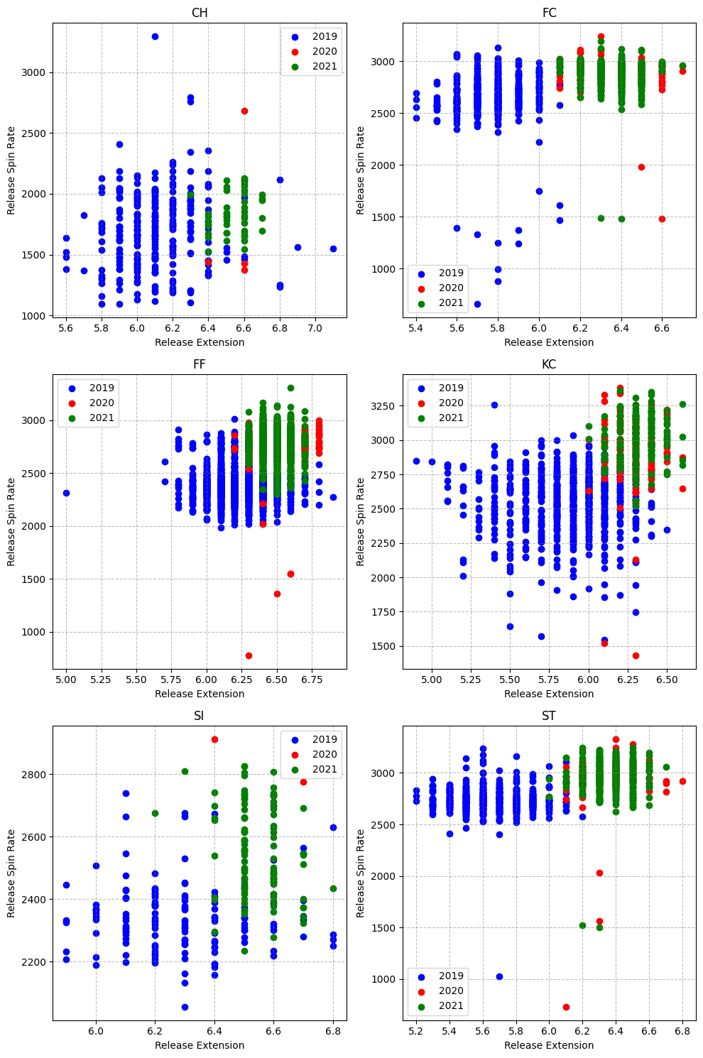
リリースからホームまでの距離 vs スピンレート (散布図)
多少は相関あるのかもしれないが、見づらい。
何かそういう風にフォーム変えたのかなあ
import matplotlib.pyplot as plt

def plot_pitch_location_by_year(df_2019, df_2020, df_2021):
    combined_df = pd.concat([df_2019, df_2020, df_2021])
    grouped = combined_df.groupby('pitch_type')

    nrows = 3
    ncols = 2
    titles = []

    fig, axes = plt.subplots(nrows=nrows, ncols=ncols, figsize=(10, 15))

    for idx, (pitch_type, data) in enumerate(grouped):
        titles.append(pitch_type)
        row = idx // ncols
        col = idx % ncols

        ax = axes[row][col]

        data_2019 = data[data.index.isin(df_2019.index)].dropna(subset=['release_extension', 'release_spin_rate'])
        data_2020 = data[data.index.isin(df_2020.index)].dropna(subset=['release_extension', 'release_spin_rate'])
        data_2021 = data[data.index.isin(df_2021.index)].dropna(subset=['release_extension', 'release_spin_rate'])

        ax.scatter(data_2019['release_extension'], data_2019['release_spin_rate'], label='2019', color='blue')
        ax.scatter(data_2020['release_extension'], data_2020['release_spin_rate'], label='2020', color='red')
        ax.scatter(data_2021['release_extension'], data_2021['release_spin_rate'], label='2021', color='green')

        ax.set_title(pitch_type)
        ax.set_xlabel('Release Extension')
        ax.set_ylabel('Release Spin Rate')

        ax.grid(which='both', linestyle='--', color='gray', alpha=0.5)
        ax.legend()

    plt.tight_layout()
    plt.show()

plot_pitch_location_by_year(df_2019, df_2020, df_2021)
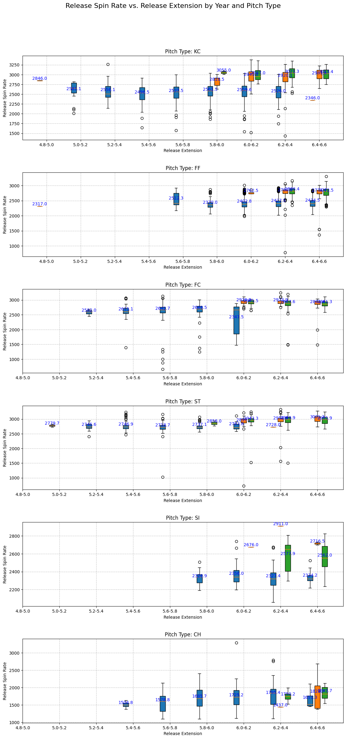
リリースからホームまでの距離 vs スピンレート (Boxplot)
無理やりboxplotで見たが、見づらい。
def plot_spin_rate_vs_extension(df_2019, df_2020, df_2021, pitch_types):
    pitch_types = [ptype for ptype in pitch_types if not pd.isnull(ptype)]

    fig, axs = plt.subplots(len(pitch_types), 1, figsize=(12, len(pitch_types) * 4))

    for i, pitch_type in enumerate(pitch_types):
        ax = axs[i]
        ax.set_title(f"Pitch Type: {pitch_type}")

        extension_bins = [4.8, 5.0, 5.2, 5.4, 5.6, 5.8, 6.0, 6.2, 6.4, 6.6]
        bin_labels = [f"{extension_bins[i]}-{extension_bins[i+1]}" for i in range(len(extension_bins)-1)]

        for year, df, color in zip([2019, 2020, 2021], [df_2019, df_2020, df_2021], ['C0', 'C1', 'C2']):
            data = df[df['pitch_type'] == pitch_type].dropna(subset=['release_spin_rate', 'release_extension'])
            if not data.empty:
                bins = pd.cut(data['release_extension'], extension_bins, labels=bin_labels)
                box_data = data.groupby(bins)['release_spin_rate'].apply(list)
                box_data = box_data[box_data.apply(lambda x: bool(x))]
                positions = [bin_labels.index(bin_label) + 1 + 0.2 * (year - 2020) for bin_label in box_data.index]
                bp = ax.boxplot(box_data.values, positions=positions, widths=0.15, patch_artist=True)

                for patch, col in zip(bp['boxes'], [color] * len(bp['boxes'])):
                    patch.set(facecolor=col)

                for j, d in enumerate(box_data):
                    mean_val = pd.Series(d).mean()
                    if pd.notna(mean_val):
                        ax.text(positions[j], mean_val, f"{mean_val:.1f}", ha='center', va='bottom', fontsize=10, color='blue')

        ax.set_xlabel('Release Extension')
        ax.set_ylabel('Release Spin Rate')  # Change the y-axis label here
        ax.set_xticks(range(1, len(bin_labels) + 1))
        ax.set_xticklabels(bin_labels)
        ax.grid(which='both', linestyle='--', color='gray', alpha=0.5)

    fig.suptitle('Release Spin Rate vs. Release Extension by Year and Pitch Type', fontsize=16, y=1.02)
    plt.tight_layout(pad=3)
    plt.show()

plot_spin_rate_vs_extension(df_2019, df_2020, df_2021, all_pitch_types)
三振取った球とか、左右どちらに強いかとか、次は研究したい
コメント
いいね
投げ銭
最新順
人気順
SHOGAKU
2 years ago
コメント
いいね
投げ銭
最新順
人気順